Alerts
Alerts are used to attract user's attention for important information without interrupting the user's flow
Example of Simple Alert Bar
Simply copy the below HTML according to your desired style
      <div class="alert alert-info">Please click on 'I agree' to continue </div>

      <div class="alert alert-warning">Incorrect Password. Try again</div>

      <div class="alert alert-error">Login error</div>

      <div class="alert alert-success">Successfully uploaded</div>
Example of Alert Bar with Icon
Simply copy the below HTML according to your desired style
      <div class="demo-container demo-alert">
      <div class="alert alert-info">
      <ion-icon name="information-circle-outline" class="alert-icon"></ion-icon>
      Please click on 'I agree' to proceed
      </div>

      <div class="alert alert-warning">
      <ion-icon name="warning-outline" class="alert-icon"></ion-icon></i>
      Incorrect Password. Try again
      </div>

      <div class="alert alert-error">
      <ion-icon name="bug-outline" class="alert-icon"></ion-icon>
      Login error
      </div>

      <div class="alert alert-success">
      <ion-icon name="checkmark-circle-outline" class="alert-icon"></ion-icon>
      Successfully uploaded
      </div>
Example of Alert Bar with Icon and Dismiss
Simply copy the below HTML according to your desired style
      <div class="alert alert-info">
      <ion-icon name="information-circle-outline" class="alert-icon"></ion-icon>
      <span>Please click on 'I agree' to proceed</span>
      <button class="close-btn" type="button">
      <ion-icon name="close-outline" class="close-btn-icon"></ion-icon>
      </button>
      </div>


      <div class="alert alert-warning">
      <ion-icon name="warning-outline" class="alert-icon"></ion-icon></i>
      Incorrect Password. Try again
      <button class="close-btn" type="button">
      <ion-icon name="close-outline" class="close-btn-icon"></ion-icon>
      </button>
      </div>


      <div class="alert alert-error">
      <ion-icon name="bug-outline" class="alert-icon"></ion-icon>
      Login error
      <button class="close-btn" type="button">
      <ion-icon name="close-outline" class="close-btn-icon"></ion-icon>
      </button>
      </div>


      <div class="alert alert-success">
      <ion-icon name="checkmark-circle-outline" class="alert-icon"></ion-icon>
      Successfully uploaded
      <button class="close-btn" type="button">
      <ion-icon name="close-outline" class="close-btn-icon"></ion-icon>
      </button>
      </div>
Demo of Alert with Close Button
To create a dismissable alert, simply pick your alert style and wrap it in the alert container like below. Don't forget to include the script!
      <div class = "alert-container hide-display">
      <div class="alert alert-success">
      <ion-icon name="checkmark-circle-outline" class="alert-icon"></ion-icon>
      Successfully uploaded
      <button class="close-btn" id="alert-close-btn" type="button">
        <ion-icon name="close-outline" class="close-btn-icon"></ion-icon>
      </button>
      </div>
      </div>
      <button class="alert-display-btn" id = "alert-display-btn">Demo</button>
      </div>
      const closeButton = document.querySelector("#alert-close-btn");
      const alertContainer = document.querySelector(".alert-container");
      const alertDisplayButton = document.querySelector("#alert-display-btn");

      alertDisplayButton.addEventListener("click", () => {
      alertContainer.classList.remove("hide-display");
      });
      closeButton.addEventListener("click", () => {
      alertContainer.classList.add("hide-display");
      });
Avatar
Avatars are images used for profile pictures. They could be your own photo, your pet or anything that represents you best
Round Avatar
There are 5 different sizes available for round avatars: xs, s, m, l, xl. Simply copy the below html and choose the size per your requirement
        <div class="avatar-s">
          <img
            class="img-responsive avatar-round"
            src="https://i.pravatar.cc/150?img=68"
            alt="black and white image of a young man"
          />
        </div>
Square Avatar
There are 5 different sizes available for square avatars: xs, s, m, l, xl. Simply copy the below html and choose the size per your requirement
        <div class="avatar-s">
          <img
            class="img-responsive avatar-square"
            src="https://i.pravatar.cc/150?img=47"
            alt="smiling woman"
          />
        </div>
Text Avatar
There are 5 different sizes available for text avatars: xs, s, m, l, xl. Simply copy the below html and choose the size per your requirement
<div class="avatar-round avatar-text avatar-m">SK</div>
Badge
Badges can be used as status indicators, display notifications or highlight any textual information
Status Badge on Avatar
There are 4 different status badges available: online, offline, busy, away. Simply copy the below html and choose the status per your requirement
      <div class="avatar-xl badge-container">
        <img
          class="img-responsive avatar-round"
          src="https://i.pravatar.cc/150?img=68"
          alt="black and white image of a young man"
        />
        <span
          class="status-badge status-badge_xl status-badge_offline"
        ></span>
      </div>
Notification Badge on Icons
Simply copy the below html to style your notification badges
      <button class="notif-btn" type="button">
        <ion-icon class="notif-icon" name="cart-outline"></ion-icon>
        <span class="notif-badge">2</span>
      </button>
Text Badge
Release v1.1.2
Release v1.1.2
NewRelease v1.1.2
BetaThere are 2 sizes available for solid text badges, and 2 styles - solid, outline. Simply copy the below html and choose the style/size per your requirement
      <div class="badge-container">
        <p class="para">Release v1.1.2</p>
        <span class="text-badge text-badge_l text-badge_solid">New</span>
      </div>
Button
Buttons are webpage-elements which encourage the user to take specific actions. Primary buttons also serve as Call-To-Action(CTA) buttons
Button Styles
Simply pick your style of button from the code below
      <button class="btn btn-medium btn-primary">Primary Button</button>

      <button class="btn btn-medium btn-secondary">Secondary Button</button>

      <button class="btn btn-medium btn-link"><a href="#">Link Button</a></button>

      <button class="icon-btn">
        <a href="#"><ion-icon class="btn-icon" name="cart-outline"></ion-icon></a>
      </button>

      <button class="btn btn-primary btn-primary-with-icon">
        <ion-icon class="btn-icon" name="cart"></ion-icon>
        Button with Icon
Button Sizes
Each button style comes in 3 sizes - small, medium, large
        <button class="btn btn-small btn-primary">Primary Button</button>
        <button class="btn btn-medium btn-primary">Primary Button</button>
        <button class="btn btn-large btn-primary">Primary Button</button>
Floating Buttons
For a floating icon button, choose your icon and apply to the HTML below
      <button class="btn btn-floating">
        <a href="#"><ion-icon class="btn-icon" name="arrow-up-outline"></ion-icon></a>
      </button>
Cards
Vertical Card
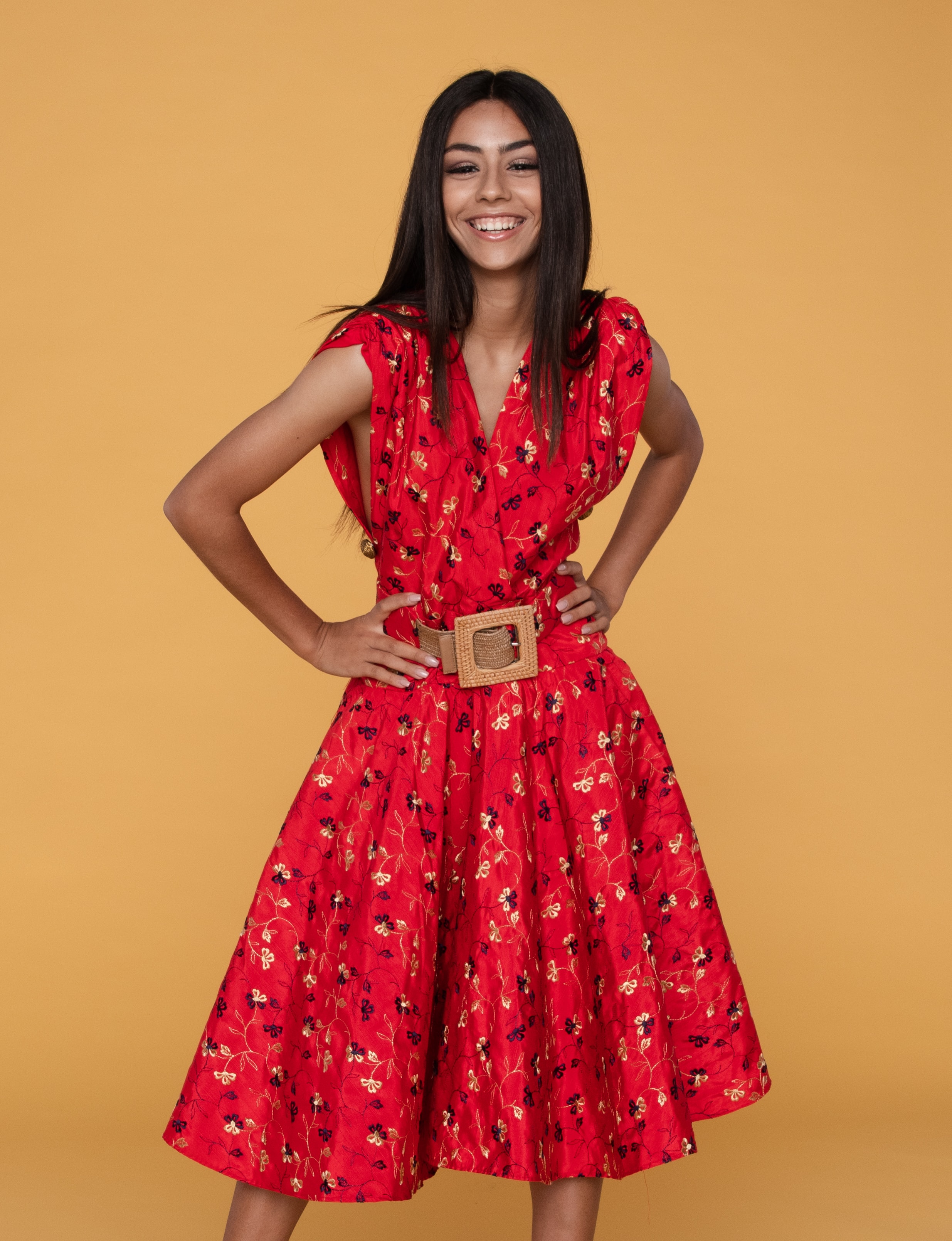
Floral Red Dress
$24.99 $28.99
Floral Red Dress
$24.99 $28.99
Floral Red Dress
$24.99 $28.99
Simply copy the below html to create a vertical card with badge and dismiss
        <div class="card-vertical">
        <div class="card-image-container">
          <img
            class="card-image img-responsive"
            src="../assets/images/product-7.jpeg"
            alt="woman in red dress"
          />
        </div>
        <div class="card-content">
          <h2 class="heading-xs">Floral Red Dress</h2>
          <p class="para-s"><strong>$24.99</strong> <del>$28.99</del></p>
          <div class="card-buttons">
            <button class="btn btn-primary btn-primary-with-icon">
              <ion-icon class="btn-icon" name="cart"></ion-icon>
              Add To Cart
            </button>
            <button class="icon-btn">
              <a href="#"
                ><ion-icon
                  class="btn-icon"
                  name="heart-outline"
                ></ion-icon
              ></a>
            </button>
            <button class="icon-btn">
              <a href="#"
                ><ion-icon
                  class="btn-icon"
                  name="share-social-outline"
                ></ion-icon
              ></a>
            </button>
          </div>
        </div>
      </div>
Vertical Card with Overlay
Floral Red Dress
$24.99 $28.99
Simply copy the below html to create a vertical card with text overlay
          <div class="card-overlay">
      <div class="card-vertical">
        <div class="card-image-container">
          <img
            class="card-image img-responsive"
            src="../assets/images/product-7.jpeg"
            alt="woman in red dress"
          />
        </div>
        <div class="card-content">
          <h2 class="heading-xs">Floral Red Dress</h2>
          <p class="para-s">
            <strong>$24.99</strong> <del>$28.99</del>
          </p>
          <div class="card-buttons">
            <button class="btn btn-primary btn-primary-with-icon">
              <ion-icon class="btn-icon" name="cart"></ion-icon>
              Add To Cart
            </button>
            <button class="icon-btn">
              <a href="#"
                ><ion-icon
                  class="btn-icon"
                  name="heart-outline"
                ></ion-icon
              ></a>
            </button>
            <button class="icon-btn">
              <a href="#"
                ><ion-icon
                  class="btn-icon"
                  name="share-social-outline"
                ></ion-icon
              ></a>
            </button>
          </div>
        </div>
        <div class="card-overlay-text">Out of Stock</div>
      </div>
    </div>
Horizontal Card
$24.99 $28.99
$24.99 $28.99
Simply copy the below html to create a horizontal card with badge
          <div class="card-horizontal">
          <div class="left-aligned-image-container">
            <img
              class="card-image img-responsive"
              src="../assets/images/product-7.jpeg"
              alt="woman in red dress"
            />
          </div>
          <div class="card-content">
            <div class="heading-xs">Floral Red Dress</div>
            <div class="para-s">
              Red midi dress in chiffon with floral pattern
            </div>
            <div class="para-xs">Sold by: kustomfit</div>

            <p class="para-s"><strong>$24.99</strong> <del>$28.99</del></p>
            <div class="card-buttons">
              <button class="btn btn-primary btn-primary-with-icon">
                <ion-icon class="btn-icon" name="cart"></ion-icon>
                Add To Cart
              </button>
              <button class="btn btn-secondary">Move to WishList</button>
              <button class="icon-btn">
                <a href="#"
                  ><ion-icon
                    class="btn-icon"
                    name="share-social-outline"
                  ></ion-icon
                ></a>
              </button>
            </div>
            <div class="text-badge card-badge">NEW</div>
          </div>
        </div>
      </div>
Grid
Grids help in designing visually and functionally aesthetic webpage layouts whih guide the user's attention as desired. This library provides four simple and responsive grid layouts to get your webpage up and running in no time
50-50 Grid Layout
Main Heading
Insert Content Here
Simply copy the below html to use this layout
        <div class="grid-50-50">
        <div>
          <h1 class="heading-l">Main Heading</h1>
          <p class="para">Insert Content Here</p>
        </div>
        <div class="grid-img-container">
          <img
            class="img-responsive"
            src="https://picsum.photos/id/1082/1400/800"
            alt="cappucino in white cup"
          />
        </div>
      </div>
60-40 Grid Layout
Main Heading
Insert Content Here
Simply copy the below html to use this layout
        <div class="grid-60-40">
          <div>
            <h1 class="heading-l">Main Heading</h1>
            <p class="para">Insert Content Here</p>
          </div>
          <div class="grid-img-container">
            <img
              class="img-responsive"
              src="https://picsum.photos/id/1082/1400/800"
              alt="cappucino in white cup"
            />
          </div>
        </div>
70-30 Grid Layout
Main Heading
Insert Content Here
Simply copy the below html to use this layout
      <div class="grid-70-30">
      <div>
        <h1 class="heading-l">Main Heading</h1>
        <p class="para">Insert Content Here</p>
      </div>
      <div class="grid-img-container">
        <img
          class="img-responsive"
          src="https://picsum.photos/id/1082/1400/800"
          alt="cappucino in white cup"
        />
      </div>
    </div>
30-70 Grid Layout
Main Heading
Insert Content Here
Simply copy the below html to use this layout
        <div class="grid-30-70">
        <div>
          <h1 class="heading-l">Main Heading</h1>
          <p class="para">Insert Content Here</p>
        </div>
        <div class="grid-img-container">
          <img
            class="img-responsive"
            src="https://picsum.photos/id/1082/1400/800"
            alt="cappucino in white cup"
          />
        </div>
      </div>
Images
Images are the backbone of any good website. Choose from responsive, round and square styles to add images to your webpages.
Responsive Image
Simply copy the below html to apply a responsive image which will fill up its parent container
      <div class="responsive-image">
        <img
          class="img-responsive"
          src="https://picsum.photos/id/1082/1400/500"
          alt="hands on piano"
          />
      </div>
Round Image
Simply copy the below html to use the round image. For best results, use images with same height and width
      <div class="responsive-image">
      <img
        class="img-responsive img-round"
        src="https://i.pravatar.cc/150?img=10"
        alt="smiling woman"
        />
    </div>
Square Image
Simply copy the below html to use the square image
      <div class="responsive-image">
      <img
        class="img-responsive img-square"
        src="https://i.pravatar.cc/150?img=10"
        alt="smiling woman"
        />
    </div>
Inputs
Input Forms are used to gather user details and/or feedback. The below form contains validation checks for incorrect user inputs
Responsive Input Form with Validation
Create Account
Simply Copy and below HTML code and don't forget to include the inputs script which is part of the library source code
      <div class="form-container">
      <div class="form-header">
        <h2 class="heading-xs">Create Account</h2>
      </div>
      <form class="form" id="form">
        <div class="form-control">
          <label>Username</label>
          <input type="text" placeholder="Username" id="username" />
          <ion-icon
            class="form-icon form-icon-success"
            name="checkmark-circle"
          ></ion-icon>
          <ion-icon
            class="form-icon form-icon-error"
            name="alert-circle"
          ></ion-icon>
          <p class="form-message">Error message</p>
        </div>

        <div class="form-control">
          <label>Email</label>
          <input type="email" placeholder="Email" id="email" />
          <ion-icon
            class="form-icon form-icon-success"
            name="checkmark-circle"
          ></ion-icon>
          <ion-icon
            class="form-icon form-icon-error"
            name="alert-circle-outline"
          ></ion-icon>
          <p class="form-message">Error message</p>
        </div>

        <div class="form-control">
          <label>Password</label>
          <input type="password" placeholder="Password" id="password" />
          <ion-icon
            class="form-icon form-icon-success"
            name="checkmark-circle"
          ></ion-icon>
          <ion-icon
            class="form-icon form-icon-error"
            name="alert-circle-outline"
          ></ion-icon>
          <p class="form-message">Error message</p>
        </div>

        <div class="form-control">
          <label>Confirm Password</label>
          <input
            type="password"
            placeholder="Confirm password"
            id="password2"
          />
          <ion-icon
            class="form-icon form-icon-success"
            name="checkmark-circle"
          ></ion-icon>
          <ion-icon
            class="form-icon form-icon-error"
            name="alert-circle-outline"
          ></ion-icon>
          <p class="form-message">Error message</p>
        </div>

        <button class="form-button">Submit</button>
      </form>
    </div>
Lists
Unordered List styles
- Todo Item-1
- Todo Item-2
- Todo Item-3
- Todo Item-1
- Todo Item-2
- Todo Item-3
- Todo Item-1
- Todo Item-2
- Todo Item-3
Simply copy the below HTML according to your desired list style
        <div class="demo-list">
        <ul class="unordered-list list-style-bullet">
          <li>Todo Item-1</li>
          <li>Todo Item-2</li>
          <li>Todo Item-3</li>
        </ul>
      </div>

      <div class="demo-list list-style-square">
        <ul class="unordered-list list-style-square">
          <li>Todo Item-1</li>
          <li>Todo Item-2</li>
          <li>Todo Item-3</li>
        </ul>
      </div>

      <div class="demo-list list-style-disc">
        <ul class="unordered-list list-style-disc">
          <li>Todo Item-1</li>
          <li>Todo Item-2</li>
          <li>Todo Item-3</li>
        </ul>
      </div>
Ordered List styles
- First, mix all the dry ingredients
- Then, add the wet ingredients
- Finally, bake the cake
- First, mix all the dry ingredients
- Then, add the wet ingredients
- Finally, bake the cake
- First, mix all the dry ingredients
- Then, add the wet ingredients
- Finally, bake the cake
Simply copy the below HTML according to your desired ordered list style
      <div class="demo-list">
      <ol class="ordered-list list-style-alphabet">
        <li>First, mix all the dry ingredients</li>
        <li>Then, add the wet ingredients</li>
        <li>Finally, bake the cake</li>
      </ol>
    </div>

    <div class="demo-list">
      <ol class="ordered-list list-style-number">
        <li>First, mix all the dry ingredients</li>
        <li>Then, add the wet ingredients</li>
        <li>Finally, bake the cake</li>
      </ol>
    </div>

    <div class="demo-list list-style-roman-number">
      <ol class="ordered-list list-style-roman-number">
        <li>First, mix all the dry ingredients</li>
        <li>Then, add the wet ingredients</li>
        <li>Finally, bake the cake</li>
      </ol>
    </div>
Inline List styles
- Home
- Login
- Contact
Simply copy the below HTML to get inline list
      <div class="demo-list">
      <ul class="list-inline">
        <li>Home</li>
        <li>Login</li>
        <li>Contact</li>
      </ul>
    </div>
Stacked Lists
-
Read this article by Susan Doe
-
Read this article by Susan Doe
Simply copy the below HTML if you like the stacked list style
      <div class="demo-list">
      <ul class="list-stacked">
        <li>
          <div class="avatar-s">
            <img
              class="img-responsive avatar-square"
              src="https://i.pravatar.cc/150?img=47"
              alt="smiling woman"
            />
          </div>
          <div>Read this article by Susan Doe</div>
        </li>
        <li>
          <div class="avatar-s">
            <img
              class="img-responsive avatar-square"
              src="https://i.pravatar.cc/150?img=47"
              alt="smiling woman"
            />
          </div>
          <div>Read this article by Susan Doe</div>
        </li>
      </ul>
    </div>
Modal
A modal prompts your user to take an action before anything else can be done. It disables the rest of the screen, and the call to action pops out.
Clean, Minimal Modal
Modal
Simple Modal which pops out of the page to attract the user's attention. Replace it with your content.
Demo
Modal
Simple Modal which pops out of the page to attract the user's attention. Replace it with your content.
Simple copy paste the below HTML and Javascript and you will have a clean modal in no time!
      <div class="demo-container demo-modal">
        <h1 class="heading-s">Demo</h1>
        <button class="display-modal" id="display-modal-btn">
          View Modal
        </button>
        <div class="modal-container" id="modal-container">
          <div class="modal">
          <h1 class="heading-m">Modal</h1>
          <p class="para">
            Simple Modal which pops out of the page to attract the user's
            attention. Replace it with your content.
          </p>
          <button class="hide-modal" id="close-modal-btn">Close</button>
        </div>
        </div>
    </div>
      const displayModalButton = document.querySelector("#display-modal-btn");
      const hideModalButton = document.querySelector("#close-modal-btn");
      const modalContainer = document.querySelector("#modal-container");

      displayModalButton.addEventListener("click", () => {
        modalContainer.classList.add("show");
      });

      hideModalButton.addEventListener("click", () => {
        modalContainer.classList.remove("show");
Rating
Ratings are an interactive way to gather feedback from the user regarding a product or service
Standard 5-star rating
Simply add the below HTML to get a flexible rating system
      <div class="stars-rating">
        <a class="rating">⭐</a>
        <a class="rating">⭐</a>
        <a class="rating">⭐</a>
        <a class="rating">⭐</a>
        <a class="rating">⭐</a>
      </div>
The script below allows you to record the rating the user provided
      const ratingStars = document.querySelectorAll(".rating");
      const rating = document.querySelector(".stars-rating");

      ratingStars.forEach((star, index) => {
        star.addEventListener("click", () => {
          let clickedIndex = index;
          console.log(`User gave ${clickedIndex + 1} rating`);
          ratingStars.forEach((otherStar, otherIndex) => {
            if (otherIndex <= clickedIndex) {
              otherStar.classList.add("active");
            }
          });
        });
      });
Typography
Typography helps give appropriate emphasis to your website elements and builds the written content on your website. Choose from the below styles to give your website a polished look!
Sample Styles
Simply copy the below html and choose the style/size per your requirement
        <div class="heading-xl">This is an Extra Large Heading</div>
        <div class="heading-l">This is a Large Heading</div>
        <div class="heading-m">This is a Medium Heading</div>
        <div class="heading-s">This is a Small Heading</div>
        <div class="heading-xs">This is an Extra Small Heading</div>
        <div class="para">This is a paragraph</div>
        <div class="para-s">This is a small paragraph</div>
Simply copy the below html and choose the style/size per your requirement
<div class="heading-s grey-text">This is grey text</div>
Simply copy the below html and choose the style/size per your requirement
<div class="heading-s centered-text">This is centered text</div>
Toast
Example of Simple Toast
Simply copy the below HTML according to your desired style
      <div class="toast toast-info">Please click on 'I agree' to continue</div>
      <div class="toast toast-warning">Incorrect Password. Try again</div>
      <div class="toast toast-error">Login error</div>
      <div class="toast toast-success">Successfully uploaded</div>
Example of Toast with Icon
Simply copy the below HTML according to your desired style
        <div class="toast toast-info">
          <ion-icon name="information-circle-outline" class="toast-icon"></ion-icon>
          Please click on 'I agree' to proceed
        </div>

        <div class="toast toast-warning">
          <ion-icon name="warning-outline" class="toast-icon"></ion-icon></i>
          Incorrect Password. Try again
        </div>

        <div class="toast toast-error">
          <ion-icon name="bug-outline" class="toast-icon"></ion-icon>
          Login error
        </div>

        <div class="toast toast-success">
          <ion-icon name="checkmark-circle-outline" class="toast-icon"></ion-icon>
          Successfully uploaded
        </div>
Example of Toast Bar with Icon and Dismiss
Simply copy the below HTML according to your desired style
        <div class="toast toast-info">
          <ion-icon name="information-circle-outline" class="toast-icon"></ion-icon>
          <span>Please click on 'I agree' to proceed</span>
          <button class="toast-close-btn" type="button">
            <ion-icon name="close-outline" class="toast-close-btn-icon"></ion-icon>
        </button>
      </div>

      <div class="toast toast-warning">
        <ion-icon name="warning-outline" class="toast-icon"></ion-icon></i>
        Incorrect Password. Try again
        <button class="toast-close-btn" type="button">
          <ion-icon name="close-outline" class="toast-close-btn-icon"></ion-icon>
        </button>
      </div>

      <div class="toast toast-error">
        <ion-icon name="bug-outline" class="toast-icon"></ion-icon>
        Login error
        <button class="toast-close-btn" type="button">
          <ion-icon name="close-outline" class="toast-close-btn-icon"></ion-icon>
        </button>
      </div>

      <div class="toast toast-success">
        <ion-icon name="checkmark-circle-outline" class="toast-icon"></ion-icon>
        Successfully uploaded
        <button class="toast-close-btn" type="button">
          <ion-icon name="close-outline" class="toast-close-btn-icon"></ion-icon>
        </button>
      </div>
Demo of toast with Close Button
To create a dismissable toast, simply pick your toast style and wrap it in the toast container like below. Don't forget to include the script!
      <div class = "toast-container hide-display">
        <div class="toast toast-success">
          <ion-icon name="checkmark-circle-outline" class="toast-icon"></ion-icon>
          Successfully uploaded
          <button class="toast-close-btn" id="toast-close-btn" type="button">
            <ion-icon name="close-outline" class="toast-close-btn-icon"></ion-icon>
          </button>
          </div>
        </div>
        <button class="toast-display-btn" id = "toast-display-btn">Demo</button>
      </div>
      const closeButton = document.querySelector("#toast-close-btn");
      const toastContainer = document.querySelector(".toast-container");
      const toastDisplayButton = document.querySelector("#toast-display-btn");

      toastDisplayButton.addEventListener("click", () => {
        toastContainer.classList.remove("hide-display");
      });
      toastCloseButton.addEventListener("click", () => {
        toastContainer.classList.add("hide-display");
      });